My old friend Ryuichi replied right away when I sent him a few screenshots of the book I was holding: “You’re reading an 80-year-old Japanese book about colors? You rock!” — though I’m pretty sure what he really meant was, “What the hell are you smoking, man?”
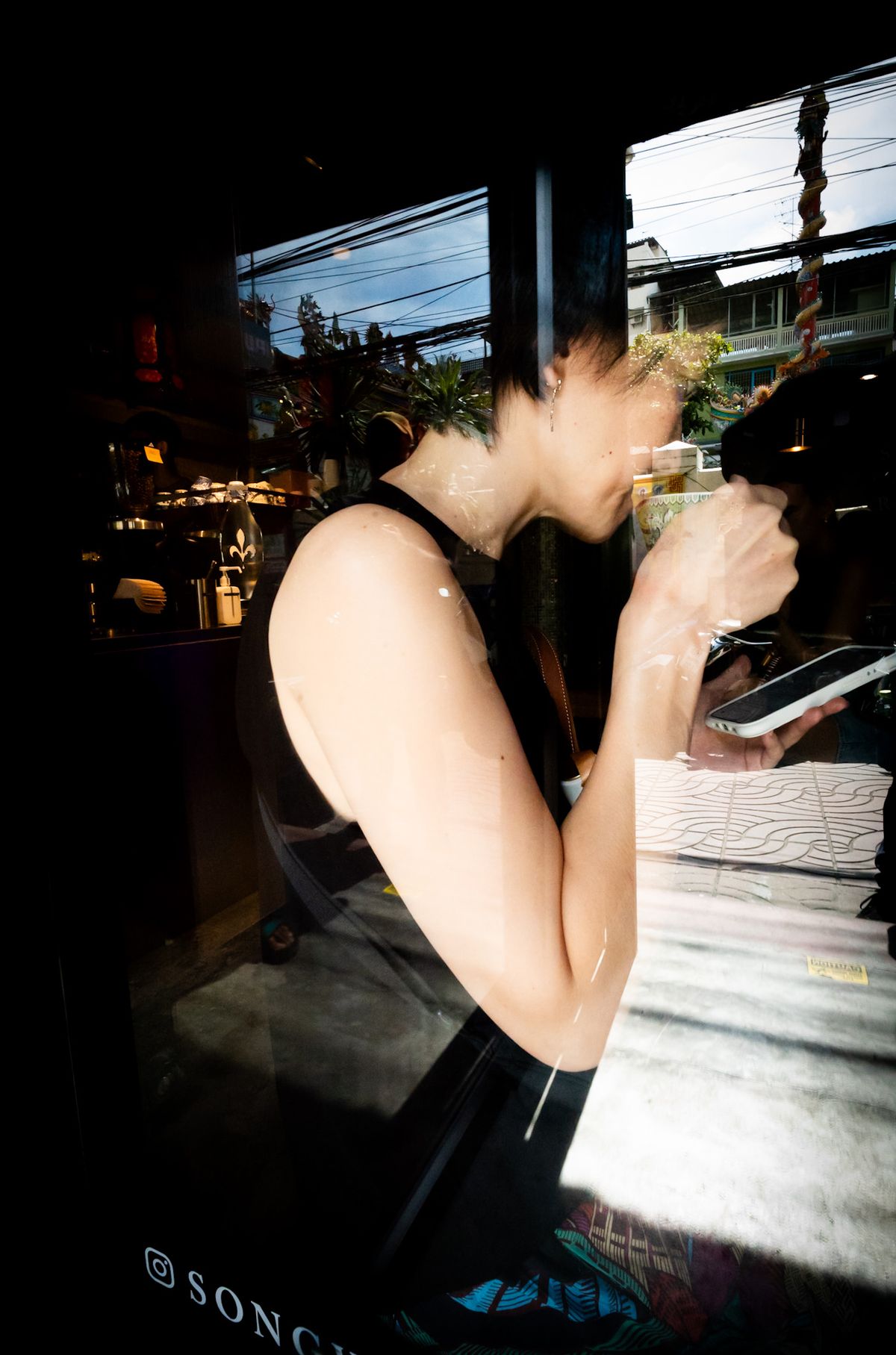
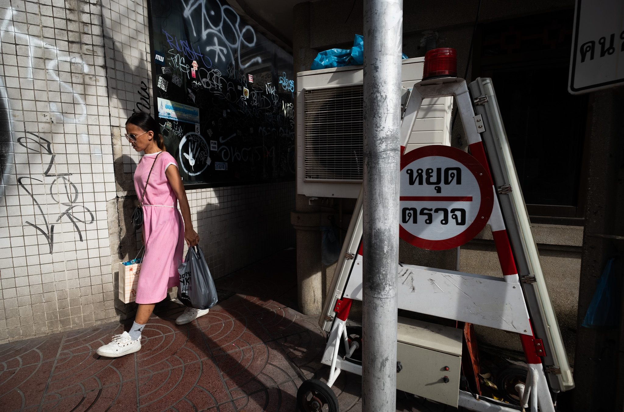
I was hunting that book since a few days after I met Rammy Narula (IG link) in Bangkok last year, swinging together in the early morning of Chinatown colors. He was often referring to the “colors theory”, and then my curiosity filled up. Finally Amazon made it.
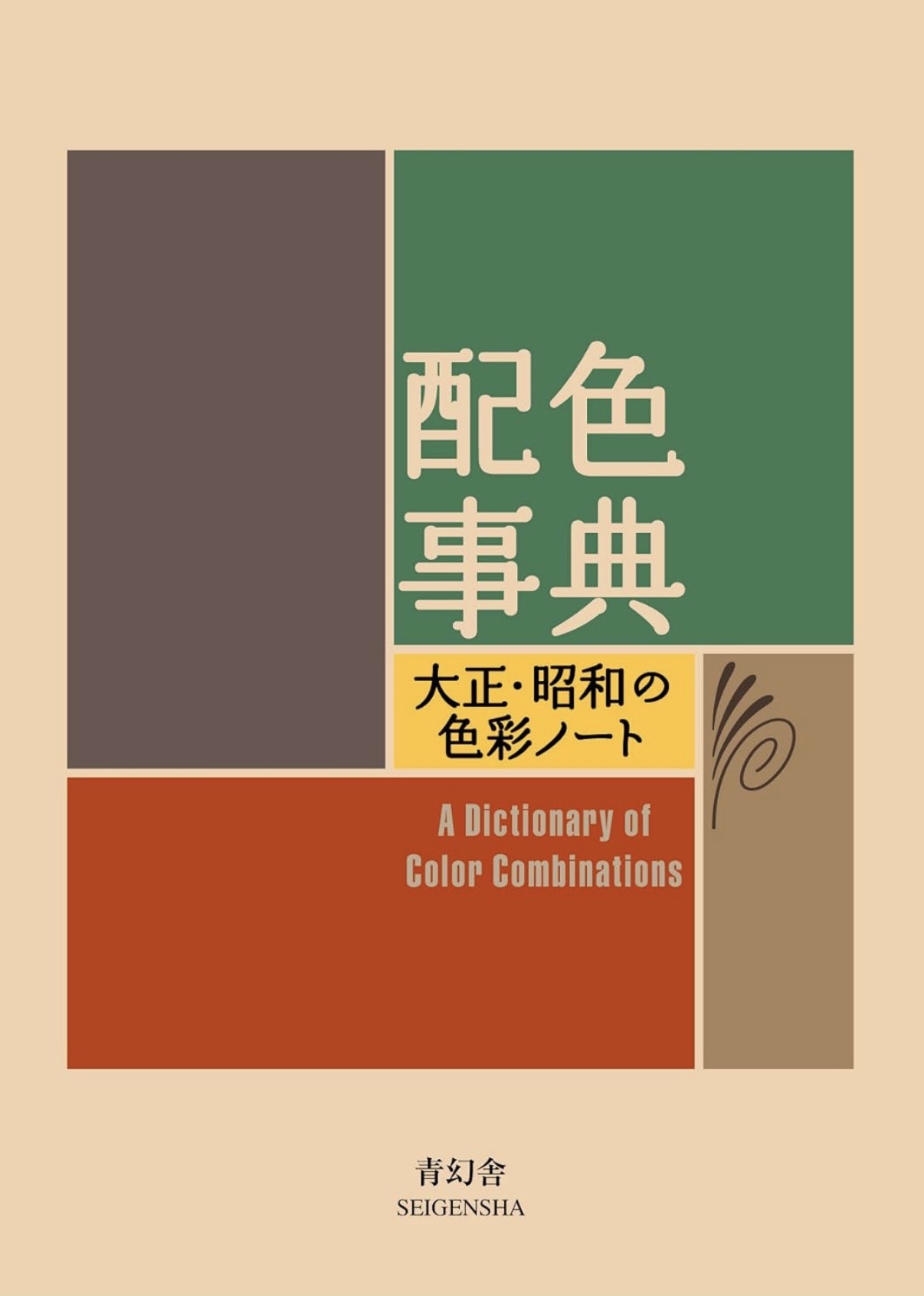
When Japanese artist and designer Sanzo Wada published
Haishoku Soukan— The Dictionary of Color Combinations — in the early 1930s, Japan stood at a crossroads between tradition and modernity. Western industrial design was reshaping cities and fashion, while centuries-old aesthetic codes — from kimono fabrics to temple interiors — still defined the nation’s visual identity. Wada’s book, composed entirely of small grids of color swatches paired in twos, threes, and fours, looked almost scientific. Yet behind its minimalist appearance lay something profoundly poetic: a visual dictionary of emotion.
Each page of Haishoku Soukan presented a harmony — sometimes bold, sometimes subtle — that bridged East and West, old and new. Wada catalogued hundreds of
combinations: crimson against celadon, mustard with indigo, ash gray beside coral pink. Some echoed the formal elegance of Edo-period art; others foreshadowed the Bauhaus and the modernist palette soon to dominate global design. His work didn’t dictate rules — it revealed relationships. He was not teaching painters what to choose, but helping them understand how colors converse.

Nearly a century later, Wada’s palette feels as
freshas ever. Designers, stylists, architects, and photographers still turn to The Dictionary of Color Combinations for inspiration. Its genius lies in restraint. In an age of digital overload and infinite chromatic options, Wada reminds us that harmony often emerges from limitation — from how two shades of similar warmth, or contrasting lightness, can evoke entirely different emotions.
But beyond design, Wada’s theory holds a wider cultural message. Color, in his view, wasn’t merely decorative; it was social, psychological, even
spiritual. His Japan was a country learning to see itself anew — adopting electric light, advertising, cinema. Through color, Wada offered a bridge: a way to carry the grace of traditional aesthetics into the
dizzyingmodern world without losing balance.

That bridge still matters today. From street fashion in Tokyo’s Harajuku to digital branding and cinematic storytelling, modern creators echo Wada’s
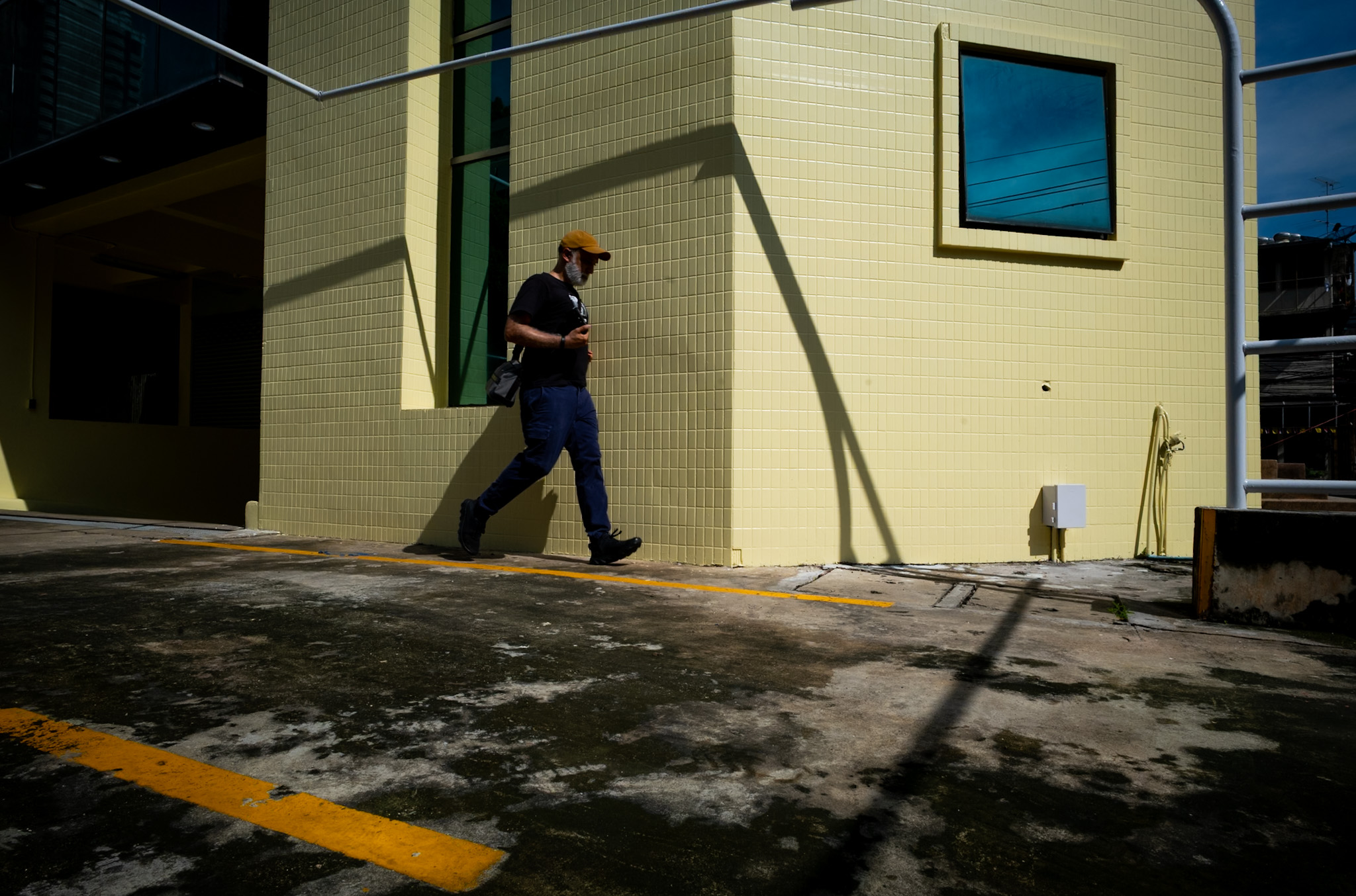
sensibility. They draw on the same emotional vocabulary — serenity in muted greens, energy in vermilion, elegance in gray. In photography, especially, Wada’s combinations are reborn. A red umbrella against a slate sky, or a mustard wall shadowed by deep teal, follows the same logic of balance and tension that Wada catalogued with a brush and ruler.
In a sense, Haishoku Soukan is not just a dictionary but a mirror. It teaches us how to look — not only at color, but at the
spaces between colors, the silent intervals where meaning lives. Each pairing is an act of attention, a reminder that perception itself is a craft.
Perhaps that is why this slim, nearly century-old book feels so modern. In a world saturated with images and guided by algorithms, Wada’s pages whisper something slower and more
human: that beauty begins in observation, and that harmony, whether in color or in life, depends on the courage to choose balance over excess.
Haishoku Soukan endures because it does what great art always does — it teaches us to see
again.
Photos from the walk Rammy and I had in BKK Chinatown on an early morning in October 2024. Leica M10-R in my hand, and 18mm in my eyes.